CG Annual Report
Year
'16
Client
Crompton & Greaves
Service
Publication Design
Challenge
Annual reports for industrial companies are almost always designed to be filed, not read. Dense financials, compliance copy, and product specs don't naturally lend themselves to something people want to engage with. The risk with CG was designing something that looked bold but still felt like a corporate obligation beneath the surface.
Solution
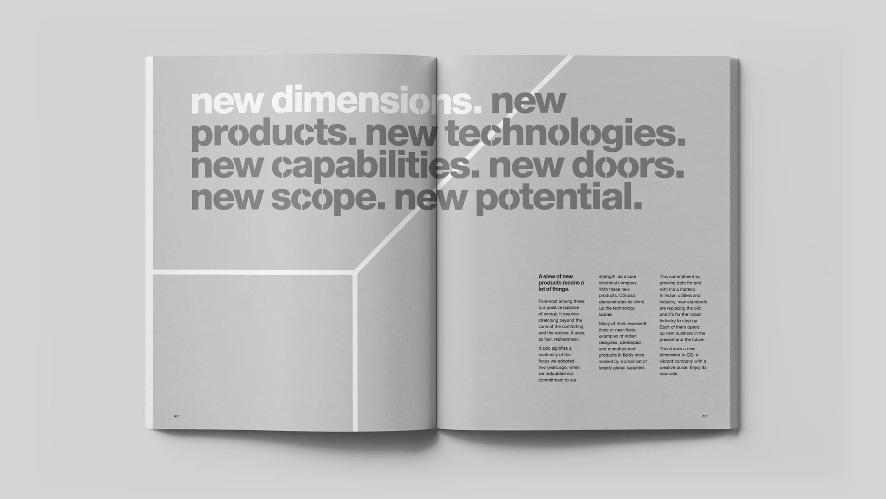
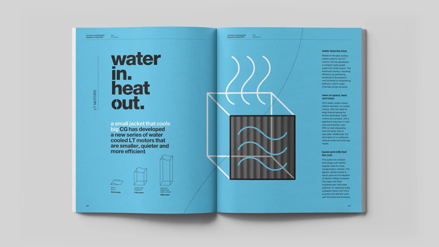
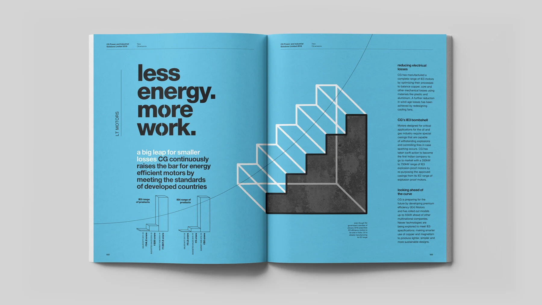
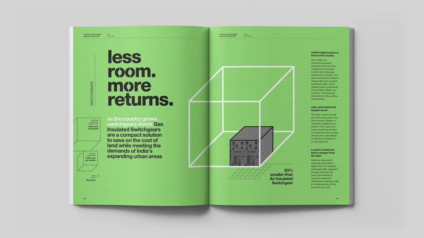
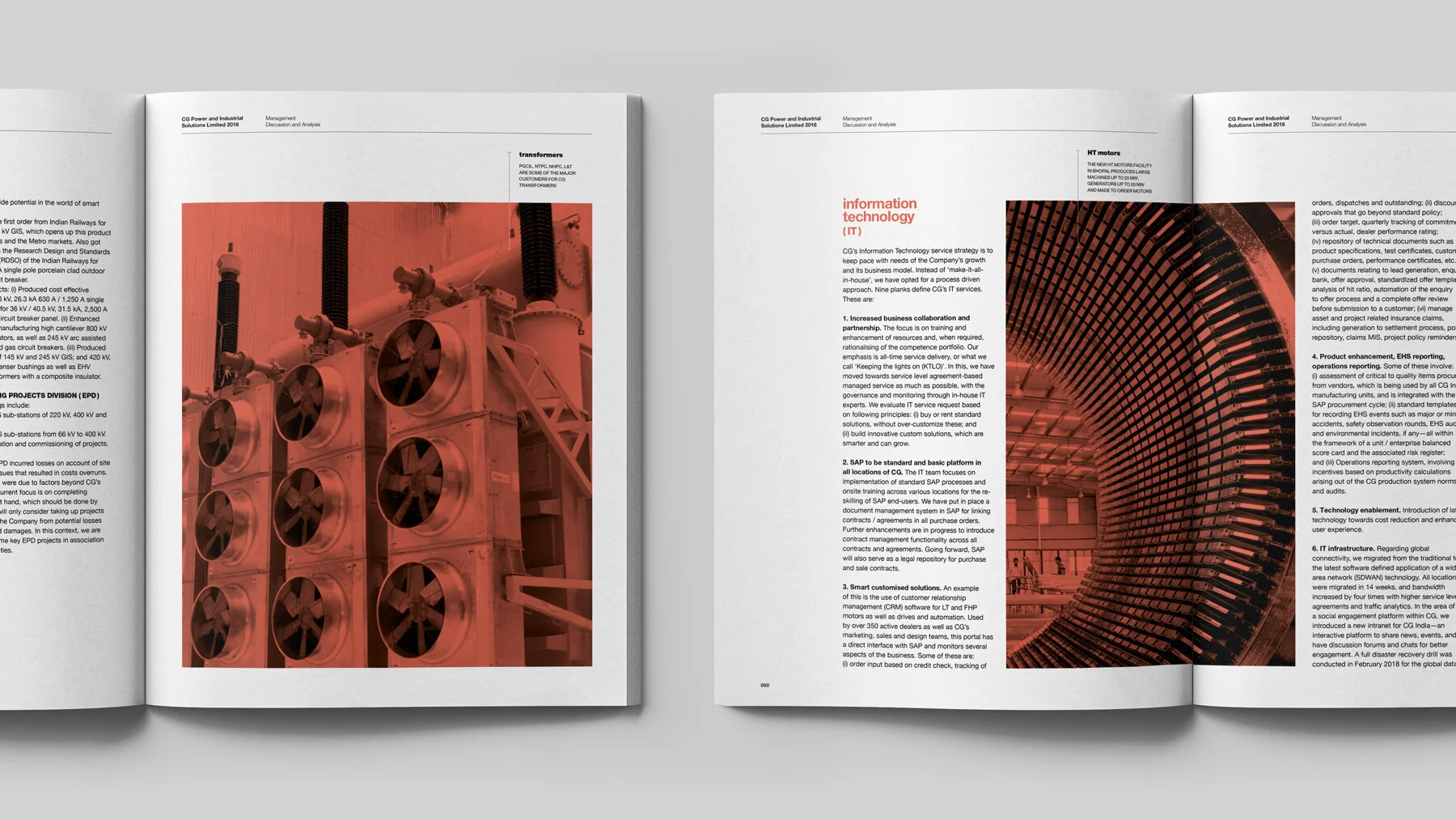
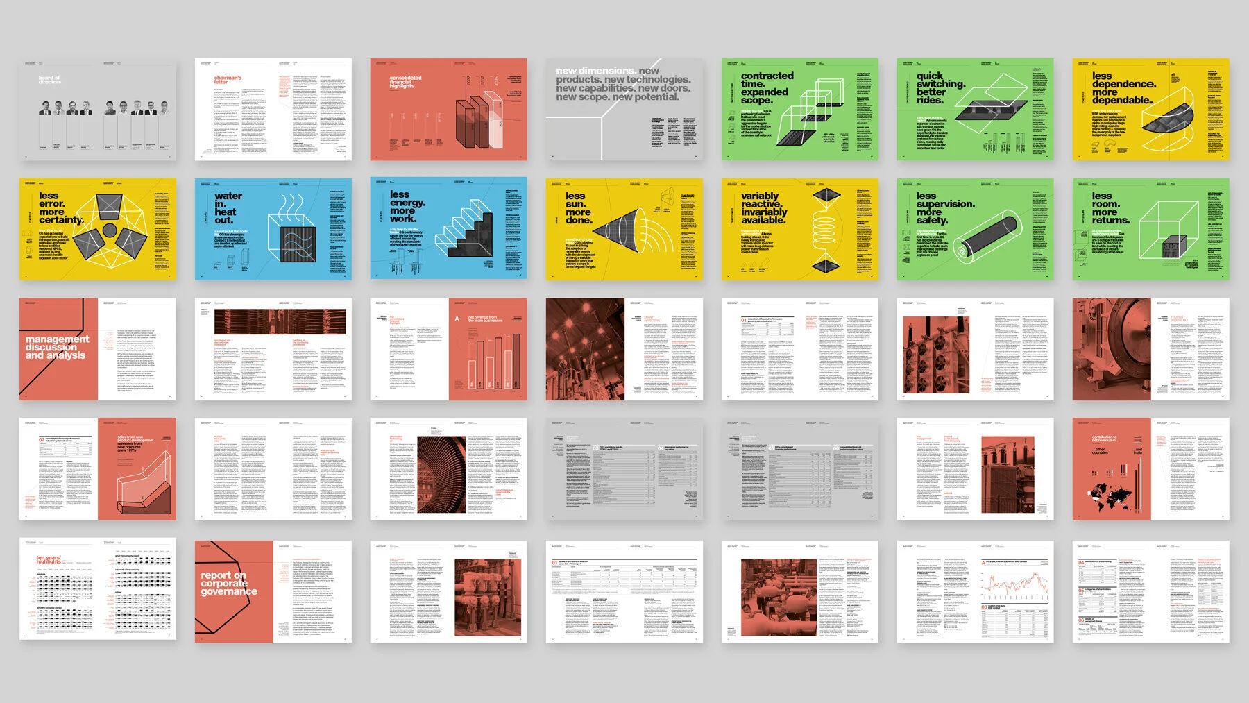
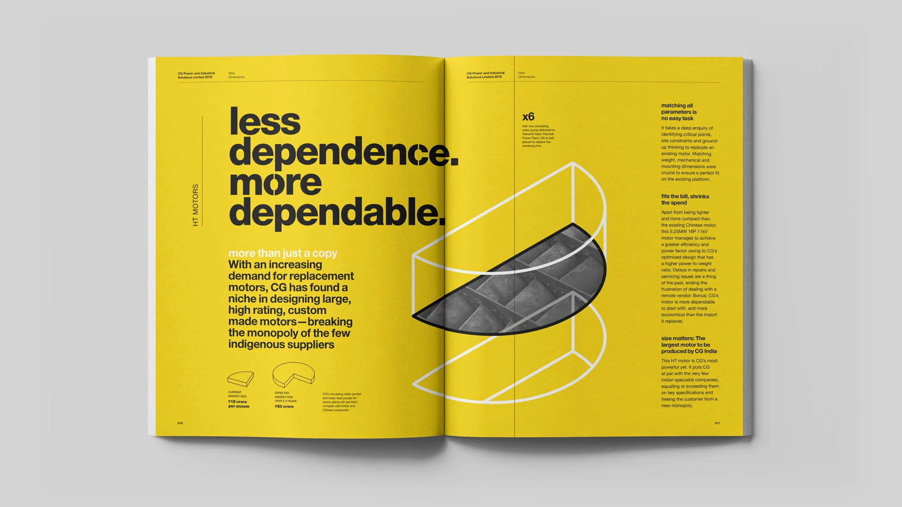
We built the report around an editorial logic rather than a document logic. Each section was led by a headline that distilled the business story into something immediate. "Contracted time. Expanded scope." "Less error. More certainty." The type does the work before the body copy even starts. A colour-coded system across sections keeps the document navigable without feeling bureaucratic, and the geometric product illustrations give the industrial subject matter a visual language that's clean and considered rather than literal. The photography sections use duotone treatment to hold the whole thing together tonally. The result is a report that actually tells a story. One you might read past the first page.